Rebuilding Manulife's Mobile Design System
I led the rebuild of Manulife's native mobile design system in 2025 as the senior designer on a three-designer team. We architected the token system, rebuilt 40+ components, and established the governance workflows that keep the system alive.
Lead Designer
2025 - 2026
01 — Context & the big picture
A system in name only
When I joined Manulife's mobile design team, two disconnected Figma libraries (iOS and Android) were built entirely on HEX styles with no connection to the brand or Canadian Design System. iOS and Android shared no structure, no naming conventions, and no source of truth.
Five designers supporting 4 LOBs (Group Benefits, Individual Benefits, Canadian Retirement, Individual Insurance, and Bank) alongside 10+ engineers, each team building components independently, duplicating effort, and accumulating inconsistency with no shared language to resolve it.
I led the rebuild alongside one product designer, without the dedicated resourcing the web design system team has.

Timline
Nine months from starting point to full readiness
This case study is password protected.
02 — Problems
Four compounding gaps
The audit surfaced four root problems:
No reusable starting point: designers rebuilt patterns from scratch every project
No theming system: light/dark built manually, high inconsistency risk
Platform fragmentation: iOS and Android designed in isolation, same feature behaving differently per platform
No standard interaction models: no shared UX patterns across LOBs
Layered on top, the Android library was built on M3 while engineering teams were still on M2, and Apple's iOS 26 liquid glass update required rethinking component architecture, not just visual updates.
03 — Solution
Token layer first, then components, then operations
Token architecture.
I designed a two-tier naming convention separating primitive tokens from semantic tokens, adopted into developer stylesheets across all LOBs. Every token connects to a shared Manulife source, enabling one-click light/dark and iOS/Android switching without manual overrides.
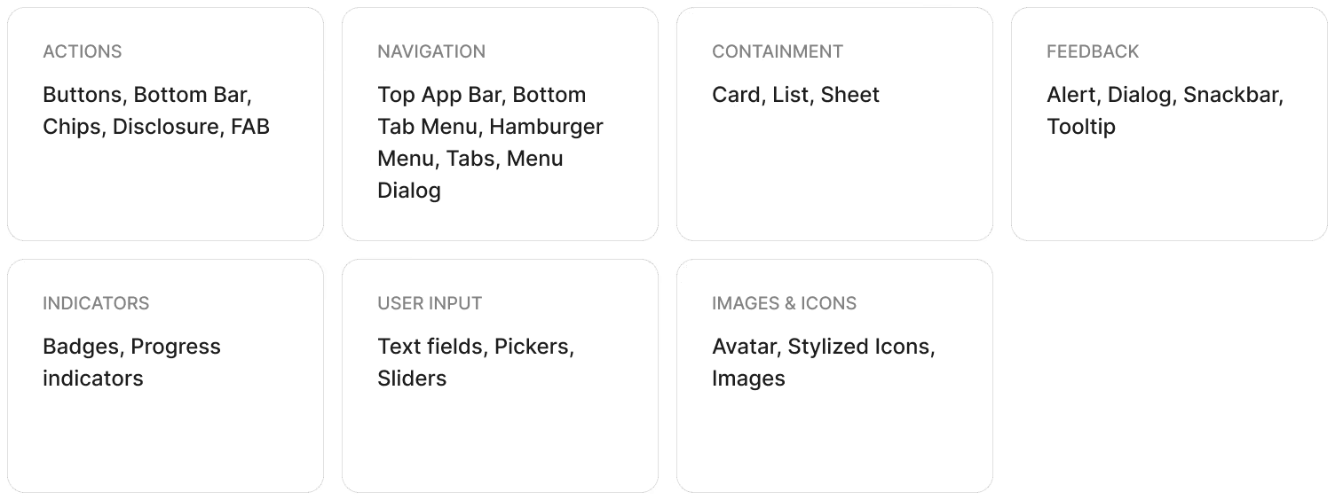
Component library.
Rebuilt 40+ components across seven categories in Figma and code, each wired to the token system and designed to handle the edge cases that previously forced detachment:
Governance.
To keep the system alive, I established four standing workflows: an intake process for component requests, an OS update protocol, system health monitoring, and release notes. A weekly cross-LOB working session with designers from all four LOBs created a shared forum for contribution and alignment. Documentation was published to a dedicated mobile section within the CDS site.
04 — Impact
What changed, and what it signals
640+
Variables audited and deprecated
40+
Components rebuilt across 7 categories
0
Detached styles or components in delivery
4 LOBs
GB, CR, IIC, and Bank all adopted the system
Handoff prep time dropped significantly and quality improved. Design QA became a formal delivery phase for the first time. The zero-detach metric, verified through Figma's design check tool, confirmed that a behaviour that had undermined system integrity for years was fully reversed.
"The token system is very necessary for the developers. It was a nightmare to add dark mode support back in 2020 because everything was hardcoded as #FFF and not a White or onBackground token."
Senior Mobile Software Engineer
"We love the new token naming system. It has been a huge time saver in knowing exactly what token we need to use."
Senior Android Mobile Engineer
What I'd do differently.
I'd instrument adoption earlier, tracking component coverage across LOB files from day one. Longitudinal coverage data would make the business case for sustained investment far more concrete than a point-in-time metric alone.